The Customization wizard for the Subscriber Interface makes it possible for the data administrator to customize every page and email that a subscriber will see. This makes it easier to focus on your subscriber’s “touch points” and convey your organization’s message. This same customization can be applied to all of the pages related to a single dataset or to each individual page. For example, text for some lists can be in English, while text for others can be in French, or the entire look and feel of the signup page for an individual list can be different from all other lists in the dataset.
Each template in the Customization wizard maintains two versions – a draft version and a production version. This allows you to test the draft version of the template, using varying conditions, before releasing it into production. Also, each screen of the Customization wizard contains its own context-sensitive help. These instructions guide you through the Customization wizard, describing each template or page, listing the placeholders used, and showing you how each template or page relates to the others.
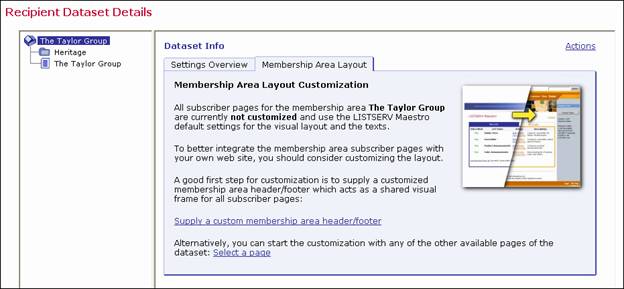
To access the Customization wizard, click on the Recipient Warehouse icon, and then select Recipient Datasets. Click on the name of the dataset that you want to customize. The Recipient Dataset Details screen opens. The right pane contains two tabs; click on the Membership Area Layout tab. If you have not customized your subscriber pages, then a general overview and introduction into the topic of membership area customization is displayed.
Note: If the subscriber pages are not customized, then LISTSERV Maestro will use the default setting for the visual layout and text.
Figure 1 General Overview of the Membership Area Layout Tab
To start customization, click on either the name of the dataset or the name of the list you want to customize, and then click one of these links:
· Supply a custom membership area header/footer – This link lets you access the Customize Page Layout screen. For more information, see Section 2.3 Using the Customize Page Layout Screen.
In addition, this link takes you directly to the Membership Area Header/Footer Template. This template is (by default) shared by all pages in the membership area; therefore, any changes to it will automatically affect all pages. Because of this, the template is the ideal place to start the customization, providing a common layout for all pages. For more information on customizing this template, see Section 2.4.1 The Membership Area Header/Footer Template.
· Select a page – This link refreshes the Membership Area Layout tab, displaying a list of layout elements available for customization. For more information, see Section 2.2 Using the Membership Area Layout Tab.
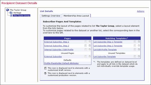
Important: The introductory page is only shown if no customization has been previously performed. If any of the layout elements for the membership area have been customized, then the Membership Area Layout tab is shown with a list of customizable layout elements. For a dataset, the layout elements are divided into three tables – Templates, Pages, and Subscriber Notification Mails. For a list, the layout elements are divided into two tables – Pages and Matching Templates. For more information, see Section 2.2 Using the Membership Area Layout Tab.
If no customization has been done previously, then clicking on the Membership Area Layout tab displays a general overview, as described in the previous section. To refresh the tab and display a list of layout elements available for customization, click the Select a Page link.
If customization has been done, then
clicking on the Membership Area Layout tab takes you directly to the list
of layout elements available for customization. The tab is divided into
two panes. The left pane displays all of the recipient lists in the dataset
in a tree-like structure, the dataset as the root and each list as a node.
Hosted Recipient Lists are shown with this node icon, ,
while Hosted LISTSERV Lists are shown with this node icon,
,
while Hosted LISTSERV Lists are shown with this node icon, . Categories (which are optional) are displayed as folders
with the folder icon,
. Categories (which are optional) are displayed as folders
with the folder icon,  . Category folders with content (at
least one list or subcategory in it) show a little
. Category folders with content (at
least one list or subcategory in it) show a little  icon (if
the folder is closed) or
icon (if
the folder is closed) or  icon (if the folder is open).
Click on the “+” or “-” icon to open or close a category folder. To select
a node, simply click on it.
icon (if the folder is open).
Click on the “+” or “-” icon to open or close a category folder. To select
a node, simply click on it.
The right pane displays a list of all the customizable layout elements. For a dataset, the layout elements are divided into three tables – Templates, Pages, and Subscriber Notification Mails. For a list, the layout elements are divided into two tables – Pages and Matching Templates.
Note: The List Pages table contains the actual layout elements that can be customized for the selected list, while the Matching Templates table contains the layout elements of the dataset that the list belongs to. However, since the list pages, by default, make use of these templates, the templates have been included for convenience. When you make changes to the list templates, these changes apply to all lists in the datasets. To make changes to individual list pages, you must change the pages not the templates.
Each table lists the available elements and displays their current customization status:
 The draft version
of the layout element is not customized.
The draft version
of the layout element is not customized.
 The draft version
of the layout element is customized.
The draft version
of the layout element is customized.
 The production
version of the layout element is not customized.
The production
version of the layout element is not customized.
 The production
version of the layout element is customized.
The production
version of the layout element is customized.
Figure 2 The Membership Area Layout Tab for a Dataset
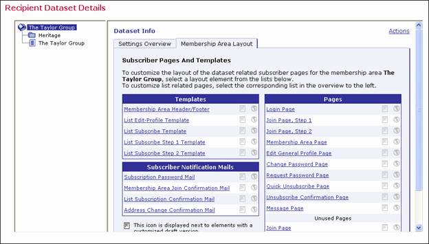
Figure 3 The Membership Area Layout Tab for a List
To start customizing a layout element, simply click on it. The Customize Page Layout screen opens and is divided into two panes. The left pane contains information on the selected page. The right pane contains two tabs – Draft Version and Production Version. For more information on this screen, see Section 2.3 Using the Customize Page Layout Screen.
To customize an advanced element, such as user messages or input validation errors, click on the Advanced Customization link at the bottom of the tab. The Membership Area Layout tab refreshes and contains two tables – Message Page Texts and Input Validation Errors. Click on a link to customize that particular layout element. For information on editing messages and validation errors, see Section 2.6 Editing Informational and Error Messages.
Note: The Advanced Customization link is only available if you’re customizing the subscriber pages for a dataset.
To customize how profile data fields are displayed on all pages, click the Profile-Placeholder Default Attributes link. For more information, see Section 2.8 Setting the Default Display for Data Fields.
If at least the draft or production
version of a layout element is customized (or both), then either a " " or a "
  " sign is displayed between
the two icons. This lets you know whether or not the current draft version
is equal to the current production version. If both versions are not customized,
then the equals-sign is not displayed because the two versions are the
same.
" sign is displayed between
the two icons. This lets you know whether or not the current draft version
is equal to the current production version. If both versions are not customized,
then the equals-sign is not displayed because the two versions are the
same.
 If you have at least one layout
element in the dataset where the draft version is different than the current
production version, then the Deploy icon allows you to deploy all
these draft versions at once (either the ones in the dataset itself or
all draft versions in the dataset and all its lists).
If you have at least one layout
element in the dataset where the draft version is different than the current
production version, then the Deploy icon allows you to deploy all
these draft versions at once (either the ones in the dataset itself or
all draft versions in the dataset and all its lists).
When changes are made to the dataset or lists after customizations have been made, the customized pages may become incompatible with the dataset. For example, if new fields are added to the dataset, then customized pages that do not include placeholders for these new fields are no longer valid. When this happens, the following symbols may be displayed instead of the symbols described above:
 The draft version of the page is customized, but the
customized version is no longer compatible with the dataset. Therefore,
before you can view (or deploy) the current customized draft version,
you will have to make it compatible to the dataset again.
The draft version of the page is customized, but the
customized version is no longer compatible with the dataset. Therefore,
before you can view (or deploy) the current customized draft version,
you will have to make it compatible to the dataset again.
 The production version of the page is customized, but
the customized version is no longer compatible with the dataset. Therefore,
the system has automatically modified the customized production version
to make it compatible again (and has saved a backup copy of the original
customized production version).
The production version of the page is customized, but
the customized version is no longer compatible with the dataset. Therefore,
the system has automatically modified the customized production version
to make it compatible again (and has saved a backup copy of the original
customized production version).
If the customization of any page is currently incompatible to the matching dataset, then the tab also displays an additional notification message about this and contains a link to a page where you can access all incompatible pages.
If no customization has been done previously, the Customize Page Layout screen can be accessed by clicking the Supply a custom membership area header/footer link, as described in Section 2.1 Accessing the Customization Wizard.
If customization has been done, then the Customize Page Layout screen can be accessed by clicking on the name of one of the layout elements on the Membership Area Layout Tab. For information on this tab, see Section 2.2 Using the Membership Area Layout Tab.
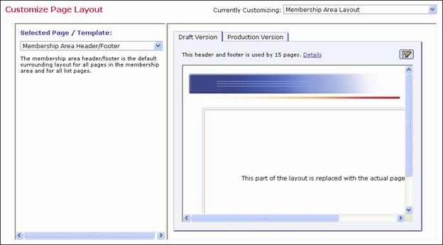
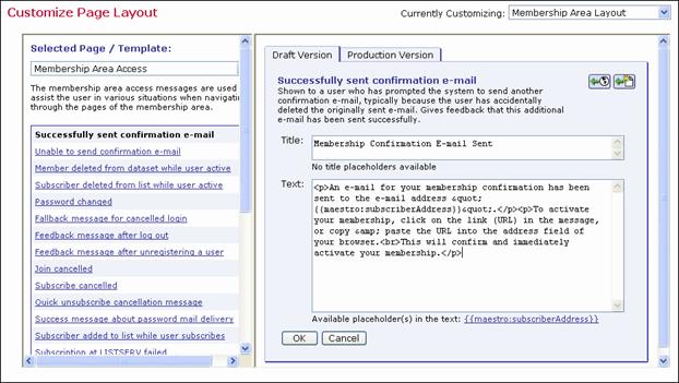
In the upper right corner of the Customize Page Layout screen, the Currently Customizing drop-down menu allows you to easily switch from customizing a dataset to customizing a list. To customize the membership area layout for the dataset, click the drop-down menu and select Membership Area Layout. This layout is shown by default if this is your first time accessing this screen. To customize the list(s) in the dataset, click the drop-down menu and select the list you want to customize (i.e. if you have a list named XYZ, then select Layout of List XYZ).
The Customize Page Layout screen is divided into two panes. The left pane is where you select the page or template that you want to customize. The default is the Membership Area Header/Footer page. To change, simply click the Selected Page/Template drop-down menu and select a different page or template to work with. From this menu, you can also select to customize notifications, messages, or errors.
Once you make a selection, the area below the drop-down menu displays the following:
· If you selected a template page, normal page, or a notification email, then a short description of the selected layout element is displayed.
· If you selected a message text for a message group, then a list of available messages for that group is displayed. Click on one of the messages to select it as the layout element you want to customize (or view). When you initially select a message group from the drop-down menu, the first message in the group is selected by default.
· If you selected an input validation error for an error group, then a list of available errors for that group is displayed. Click on one of the errors to select it as the layout element you want to customize (or view). For each error group, there is an Error Group Header/Footer layout element that defines a common opening and closing text that is shared by all of the errors in this group. This header/footer appears first in the list of errors for the group and is selected, by default, when you initially select an error group from the drop-down menu.
Figure 4 Customizing the Membership Area Layout
The right pane contains two tabs – the Draft Version tab and the Production Version tab. The production version is the version that subscribers, who access the membership area pages, actually see. The draft version, on the other hand, is not visible to the subscribers. This means that you can safely make any changes to the draft version without them becoming immediately visible. For example, you may want to customize one page after the other by editing their draft versions; but, you want to make the customized versions available all at once, after you have finished with all pages. Or, you may want to experiment a bit with the layout, without disturbing the actual production versions that subscribers see. Only when you finally deploy the draft version as the new production version will your changes become visible to subscribers.
Depending on the type of element you selected, the initial preview of the draft version is displayed in different ways:
· If you selected a template, then the preview displays the page as a normal HTML page, as it would appear in the subscriber’s browser. Since the page being displayed is a template, a rectangular placeholder frame is used at the location where the actual content will appear when the template is used by a page.
· If you selected a normal page, then the preview displays the pages as a normal HTML page, as it would appear in the subscriber’s browser.
· If you selected a subscriber notification email, then the preview displays the email in text format, and also displays the other email attributes like the From address, Subject line, and language charset that will be used. It also displays the currently used "maximum line length", i.e. the line length used to wrap the text with.
· If you selected a message page text, then the preview of the message page texts is shown by displaying the actual message page (which, by itself, is one of the normal pages, see above) as a HTML page, as it would appear in the browser of the subscriber with the currently selected message in place.
· If you selected an input validation error, then the error is shown by displaying a default page with the selected error message displayed on this default page.
Various action icons may be displayed, letting you execute certain actions on the current draft version of the selected layout element. Not all actions are always available.
 Edit Source – Click to edit the current
draft version. For information on editing a specific layout element see
the following sections: Section 2.4 Editing
Templates and Pages, Section 2.5 Editing
Subscriber Notification Emails, and Section 2.6 Editing
Informational and Error Messages.
Edit Source – Click to edit the current
draft version. For information on editing a specific layout element see
the following sections: Section 2.4 Editing
Templates and Pages, Section 2.5 Editing
Subscriber Notification Emails, and Section 2.6 Editing
Informational and Error Messages.
 View Source
– Click to view the source of the current production version.
View Source
– Click to view the source of the current production version.
 Deploy as Production Version –
Click to deploy the current draft version as the new production
version. This will make a copy of the current draft version of the selected
layout element and write it into the element's production version, making
this the version of the selected element which subscribers actually see.
The draft version remains unchanged.
Deploy as Production Version –
Click to deploy the current draft version as the new production
version. This will make a copy of the current draft version of the selected
layout element and write it into the element's production version, making
this the version of the selected element which subscribers actually see.
The draft version remains unchanged.
 Copy from Production Version –
Click to make a copy of the current production version and use
it as the new draft version. This will overwrite all current changes to
the draft version. The production version remains unchanged.
Copy from Production Version –
Click to make a copy of the current production version and use
it as the new draft version. This will overwrite all current changes to
the draft version. The production version remains unchanged.
 Reset to System Default –
Click to reset the current draft version to the LISTSERV Maestro
system default. This will overwrite all manual changes to the draft version
and will reset it to its default. The production version remains unchanged.
Reset to System Default –
Click to reset the current draft version to the LISTSERV Maestro
system default. This will overwrite all manual changes to the draft version
and will reset it to its default. The production version remains unchanged.
 Show Preview – Click to show the preview of the
current production version.
Show Preview – Click to show the preview of the
current production version.
Various comments may also be displayed, depending on the type of layout element you selected to customize.
· Header/Footer Template – This comment shows how many pages (in the dataset and its lists) that are currently using the header/footer template (i.e. pages that do not have a header/footer defined of their own but are inheriting the template). Click the Details link to view a detailed list of pages using this template.
· Any of the List Page Templates – The first comment shows if the template page inherits the header/footer template (see above) or if the header/footer is defined locally on the list page template. The second comment (below the first one) shows how many list pages are currently using the corresponding template (i.e. pages that only define the layout of the actual list profile fields locally, but also inherit the rest of the page layout from this template).
· Any of the Normal Pages – The comment displays if the page inherits the header/footer template (see above) or if the header/footer is defined locally on the page.
· Any of the Message Page Texts – The comment describes the currently selected message and the circumstances under which it is displayed to the subscriber.
· Any of the Input Validation Errors – The comment describes the currently selected error message and the circumstances under which it may occur. Also, unless the current message is already the error-header/footer of the error group, then it provides a link to select the error-header/footer for the current error group. By editing the error-header/footer, you can provide all errors in one error group with the same opening and closing texts.
Additional controls may also appear, allowing you to simulate certain system states so you can verify their impact on the actual preview. These controls vary depending on the layout element selected, and only a few elements offer them. For information on these controls, please see the online help.
Templates contain the default layout and design for the subscriber pages in the membership area. Templates are used to give a uniform look to your subscriber pages and can help you customize many pages all at once. By inheriting parts from the template, repetitious work can be saved on individual pages, and a change to the template will automatically apply to all pages that use the template.
Pages are specific subscriber pages for the dataset/list. They can be customized individually, with no impact on others, or they can be customized by inheriting parts from a template.
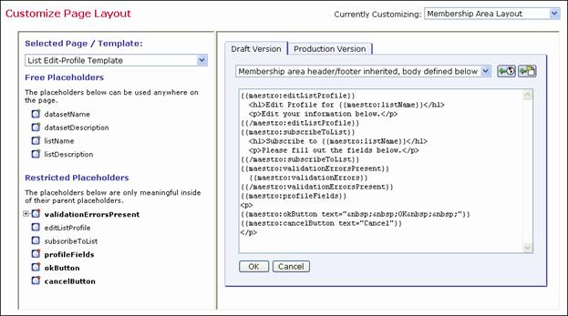
If you choose to edit the current draft version of a template or page (by clicking the Edit Source icon), then you will need to edit the HTML source code. This HTML code also includes the placeholders as specified in the left pane (see Section 2.7 Placeholders). It also defines the general layout of the page as well as the design style (see Appendix A: Custom Styles and HTML Tags). The HTML code is edited in the main edit field in the center. Above the edit field, a drop-down list is used to define what part of the page is to be edited (in the edit field), and which part is to be inherited from the applicable page template (this drop-down list is not available for the Membership Area Header/Footer Template). By inheriting parts from the template, repetitious work can be saved on the individual pages, where the HTML code that is already defined in the template does not need to be included. Also, a change to the template will automatically apply to all pages that use the template. To submit the changes, click [OK]. To cancel editing without submitting any changes, click [Cancel].
Figure 5 Editing the Source Code of a Template
There are two icons available when editing a template or page.
Copy from Production Version –
Click to make a copy of the current production version and use
it as the new draft version. This will overwrite all current changes to
the draft version. The production version remains unchanged.
Reset to System Default –
Click to reset the current draft version to the LISTSERV Maestro
system default. This will overwrite all manual changes to the draft version
and will reset it to its default. The production version remains unchanged.
The Membership Area Header/Footer Template is a common template that is shared by all pages in the membership area; therefore, any changes to this template will automatically affect all pages. Because of this, the Membership Area Header/Footer template is the ideal place to start customization, providing a common frame or layout for every page. For example, you can add a common header or footer, or you can define common HTML styles, colors, and fonts.
If you are viewing the Membership Area Header/Footer template in the Customize Page Layout screen, then the Details link is available. Click this link to see a list of the pages that are using this template. To view a specific page in the list, simply click the Open link next to that page. To exit the list and return to the preview of the template, click the Back to Template link.
To edit the template, click the Edit Source icon on the Draft Version tab of the Customize Page Layout screen. Then, enter/edit the HTML source code. This HTML code also includes the placeholders as specified in the left pane (see Section 2.7 Placeholders). When editing the Header/Footer Template, Cascading Style Sheets (CSS) should be used to customize the style of the page. The HTML code for the default pages (pages that are not customized) uses a few common HTML tags as well as custom style classes, whose look can be defined with a customized style sheet. For a list of these custom styles and HTML tags, see Appendix A: Custom Styles and HTML Tags.
The Membership Area Page is the home page of the dataset and is the first page that the subscriber sees after logging in. This page is divided into two sections – My List and My Profile – and contains links that let the subscriber navigate between these two sections.
Figure 6 Editing the Membership Area Page
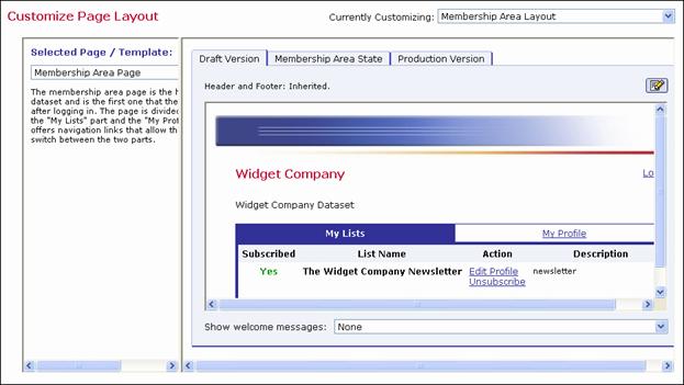
Under certain circumstances, the Membership Area Page shows additional welcome messages to the subscriber. Normally, there is no welcome message displayed. However, the following situations have their own welcome message:
· For an unconfirmed member – When the page is viewed by a member who has still not confirmed his membership (via the confirm link in the double opt-in confirmation mail), then a message is displayed reminding the member of the still unconfirmed state of their membership, and how to confirm it.
· For a new member who has just joined – When the page is viewed by a new member who has just joined the membership area (so they are viewing this page for the very first time) and has not yet confirmed their membership, then a similar reminder as above and a "Welcome to the Membership Area" message is displayed.
· For a new member who has just joined and also subscribed to a list – When the page is viewed by a new member who has not only just joined the membership area (so they are viewing this page for the very first time), but has also subscribed to the first list at the same time, and not yet confirmed their membership, then a similar reminder and welcome message as above is displayed, but the welcome message is a more specific message about the mailing list that the member has just subscribed to.
· For the first login of a known member who has just subscribed to a list – When the page is viewed by a confirmed existing member, who has just subscribed to an additional list from outside of the membership area (via the special external subscribe pages), then the member was automatically logged into the membership area and was directed to this page, which is the first page the member sees after the system has accepted their external subscription. Therefore, this page takes over the job of informing the member of the success of their external subscribe, and displays a message that they are now subscribed to the given mailing list.
To simulate these different welcome messages, click the Show welcome message drop-down menu and select one of the choices described above. In addition, the right pane displays the Membership Area State tab, which lets you define additional settings in order to simulate different subscriber states.
The Membership Area State Tab
The Membership Area State tab is a special tab that is only available if the currently selected layout element is the Membership Area Page. The controls on this tab can be used to simulate a certain subscriber and list state, impacting the preview of the Membership Area Page shown when the Draft Version tab or Production Version tab are selected. Using the Membership Area State tab, different states can be experimented with and tested in order to see how each state impacts the membership area page layout.
Figure 7 The Membership Area State Tab
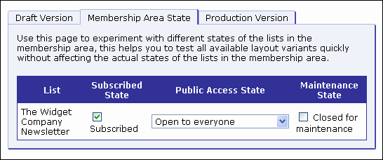
The states that can be defined correspond to the lists in the membership area. For each list, the following states can be set:
· Subscribed State – Check the Subscribed option to simulate how the page looks for a member who is subscribed to the given list. Uncheck this option to simulate a member who is not subscribed to the list.
· Public Access State – Click the drop-down menu and select the access state to simulate for the list. With this, how the page looks to a member can be verified (with the subscription state defined via the "subscribed state" checkbox, see above) if the list has the selected state. The possible states are Open to everyone, Access for subscribers only, or No public access.
· Maintenance State – Check the Closed for maintenance option to simulate that the given list is currently closed for maintenance. Uncheck this option to simulate that the list is not closed. With this, you can verify how the Membership Area Page looks to a member (with the subscription state defined via the Subscribed State checkbox, see above) when the list is closed for maintenance and when it is not.
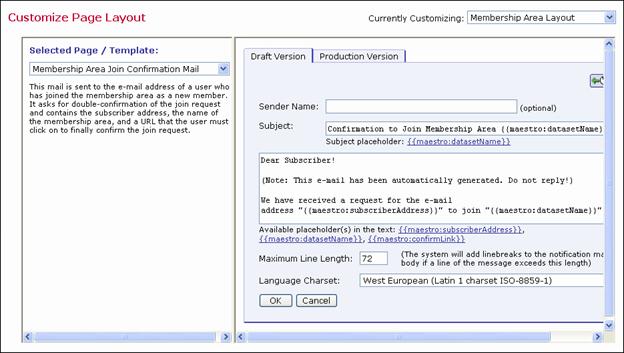
To edit a notification email, click the Edit Source icon on the Draft Version tab of the Customize Page Layout screen. Then, enter/edit the information in the following fields:
· Sender Name: Enter the name that is to be used as the sender name. Do not use an e-mail address; instead, enter a real name. This value is optional; if nothing is supplied, then only List Administrator’s address (from the dataset definition) will be shown in the From: field.
· Subject: Enter the subject line that is to be used for this notification email. Below the Subject field is a list of all placeholders that may be included in the subject line. These placeholders will be replaced with suitable values before delivery. Enter the placeholder manually into the subject line or click on the link to automatically add the placeholder at the current cursor position.
· Body: The main edit field for the e-mail body. The email will be sent as plain text. Enter its content here. Below the field a list of all placeholders that may be included in the body is shown. These placeholders will be replaced with suitable values before delivery. Enter the placeholder manually into the body or click on it to automatically add the placeholder at the current cursor position.
· Maximum Line Length: Enter the maximum line length for automatic line wrapping of the body content. In the body, use [ENTER] to insert a linebreak only when a hard linebreak is actually meant to appear. Otherwise, simply leave it to the automatic line wrapping to wrap the longer lines (paragraphs) into shorter lines just before delivery.
· Language Charset: Select the language charset (character encoding) to use for the email delivery. The charset should match the language (or the special non-ASCII characters, if any) that were used in the body.
Figure 8 Editing the Source Code of a Notification Email
To submit the changes, click [OK]. To cancel editing without submitting any changes, click [Cancel].
There are two icons available when editing a notification email.
Copy from Production Version –
Click to make a copy of the current production version and use
it as the new draft version. This will overwrite all current changes to
the draft version. The production version remains unchanged.
Reset to System Default –
Click to reset the current draft version to the LISTSERV Maestro
system default. This will overwrite all manual changes to the draft version
and will reset it to its default. The production version remains unchanged.
To edit a message text or an input validation error, select the message group or error group you want to edit, and then select the specific message/error from the list of available elements in the left pane of the Customize Page Layout screen. Once you’ve selected the message/error, then click the Edit Source icon on the Draft Version tab. Finally, enter/edit the information in the following fields, if applicable:
· Title: This field is only available for informational messages. Enter the text that is to be used as the title of the message. HTML tags can be used to format it (see Appendix A: Custom Styles and HTML Tags). Below this field there is a list of all placeholders that may be included in the title. These placeholders will be replaced with suitable values. Enter the placeholder manually into the field or click on it to automatically add the placeholder at the current cursor position.
· Text: This field is available for informational messages and input validation errors. Enter the text that is to be used as the actual message. HTML tags can be used to format it (see Appendix A: Custom Styles and HTML Tags). Below this field there is a list of all placeholders that may be included in the message. These placeholders will be replaced with suitable values. Enter the placeholder manually into the message or click on it to automatically add the placeholder at the current cursor position.
· Header or Footer: These fields are only available for the header/footer page of an input validation error. Fill out each with the corresponding text (and HTML code) that is to be used as the opening text (header) and closing text (footer) of each error message in this group. For example, by default the header of each error group contains an opening <ul> tag and the footer contains the matching closing </ul> tag; together, they define an unnumbered list in HTML. Consequently, the default error messages all start with <li> to constitute a bullet in this list. For a list of HTML tags, see Appendix A: Custom Styles and HTML Tags.
Figure 9 Editing the Source Code of an Email Message
To submit the changes, click [OK]. To cancel editing without submitting any changes, click [Cancel].
There are two icons available when editing an informational or error message.
Copy from Production Version –
Click to make a copy of the current production version and use
it as the new draft version. This will overwrite all current changes to
the draft version. The production version remains unchanged.
Reset to System Default –
Click to reset the current draft version to the LISTSERV Maestro
system default. This will overwrite all manual changes to the draft version
and will reset it to its default. The production version remains unchanged.
Placeholders are used in pages and templates to represent parts of the page or template that are defined elsewhere and will be filled in with their final values when the page is displayed to the subscriber. Placeholders come in different types:
· Profile placeholders represent the data fields that make up the “profile” of individual dataset members and list subscribers. The syntax for the profile placeholder of a data field called “XYZ” is {{maestro:profileXYZ}}. When a page is displayed to the subscriber, then the placeholder will be replaced by the value of XYZ for that subscriber. The display name defined for the field is represented by the {{maestro:labelXYZ}} placeholder. Changing the display name in the dataset definition will automatically update all the pages that use this placeholder.
· Structural placeholders represent pages or parts of pages. For example, in the header/footer template, the {{maestro:body}} placeholder represents the “body” part of pages that inherit the header/footer template. In a fully customized page, the {{maestro:body}} placeholder marks the beginning of the body part of the page, and the {{/maestro:body}} placeholder marks the end of the body part. If the page is subsequently changed to inherit the header and footer from the header/footer template, then only the part of the page between these two placehoders will be retained.
· Conditional placeholders mark the beginning and end of parts of the page or template that are displayed under certain conditions. For example, on certain pages and templates, the {{maestro:validationErrorsPresent}} and {{/maestro:validationErrorsPresent}} placeholders surround the text and code that will be used only if validation errors have been detected. The {{maestro:validationErrors}} placeholder, which can only be used within this conditional block, will be replaced by the relevant validation error text, as defined in the error message templates.
When you are editing a template or page, then the placeholder tree structure is displayed. This structure defines the placeholders that can be used for the customization of the selected page or template. Placeholders are divided into two categories – Free Placeholders and Restricted Placeholders. Free Placeholders may appear anywhere on the page; Restricted Placeholders, when used on a page, must conform to the same tree structure that is shown in the left pane.
The placeholder tree structure shows each placeholder by name and uses the following symbols to denote what type of placeholder it is.
The placeholder tree shows each placeholder by its name using the following symbols:
 Free Placeholder – Free placeholders may appear
anywhere on the page, even inside other placeholders. They are always
optional, which means that you can include them, but do not have to.
Free Placeholder – Free placeholders may appear
anywhere on the page, even inside other placeholders. They are always
optional, which means that you can include them, but do not have to.
 Optional Restricted Placeholders – Restricted placeholders
must adhere to their parent-child structure. This means that all top-level
restricted placeholders (i.e. the ones without any further parents in
the tree structure) can be used anywhere on the page, at top level (not
inside other placeholders), while sub-level placeholders can only be used
on the page if they appear inside their matching parent placeholder (as
defined by the tree structure). An optional restricted placeholder can
be included on the page, but does not have to be included. If such a placeholder
is omitted, all its children (if any) must be omitted too.
Optional Restricted Placeholders – Restricted placeholders
must adhere to their parent-child structure. This means that all top-level
restricted placeholders (i.e. the ones without any further parents in
the tree structure) can be used anywhere on the page, at top level (not
inside other placeholders), while sub-level placeholders can only be used
on the page if they appear inside their matching parent placeholder (as
defined by the tree structure). An optional restricted placeholder can
be included on the page, but does not have to be included. If such a placeholder
is omitted, all its children (if any) must be omitted too.
 Mandatory Restricted Placeholders – The same rules
about restricted placeholders as already described above for optional
restricted placeholders apply here too, but placeholders of this type
are mandatory (i.e. they must appear on the page); otherwise, the customization
is not accepted by the system. Mandatory placeholders are also marked
by using a bold font for their name.
Mandatory Restricted Placeholders – The same rules
about restricted placeholders as already described above for optional
restricted placeholders apply here too, but placeholders of this type
are mandatory (i.e. they must appear on the page); otherwise, the customization
is not accepted by the system. Mandatory placeholders are also marked
by using a bold font for their name.
In the tree structure, placeholders with
further children are preceded by a  symbol (if the children
are currently not visible) or
symbol (if the children
are currently not visible) or  symbol (if the children
are currently visible). Click on the “+” or “-“ symbol to make the children
visible or to hide them.
symbol (if the children
are currently visible). Click on the “+” or “-“ symbol to make the children
visible or to hide them.
If you click on a placeholder (i.e. its
symbol or name), then the placeholder is selected and shown inside of
a blue box, with an additional short description of the placeholder. Therefore,
if you do not remember what a certain placeholder does exactly, or why
it is required or not, simply select the placeholder to see this description.
If you are editing the draft version, the box also contains a small green
arrow  . When you click the arrow, the placeholder tag for
the placeholder will automatically be inserted into the page code (in
the right pane) at the current cursor position. This arrow is not available
when viewing the source of the production version.
. When you click the arrow, the placeholder tag for
the placeholder will automatically be inserted into the page code (in
the right pane) at the current cursor position. This arrow is not available
when viewing the source of the production version.
If you want to use a placeholder on the page, then you will need to write it using the special placeholder tag syntax. The syntax is slightly different depending on whether or not the placeholder contains a body.
· Without Body: The placeholder tag consists of a single tag and looks like this:
{{maestro:NAME}}
where you must replace "NAME" with the placeholder name (as shown in the tree). Placeholder names are case sensitive.
· With Body: The placeholder tag consists of an opening and closing tag, with the placeholder body between the tags, such as:
{{maestro:NAME}}...placeholder body goes here...{{/maestro:NAME}}
where you must replace "NAME" (in both the opening and closing tags) with the placeholder name (as shown in the tree).Placeholder names are case sensitive. The body, which is only outlined in the example above, can be any further HTML code and may also contain linebreaks (i.e. stretch over several lines or paragraphs). Also, the placeholder tags of the placeholder’s children must appear within this body. For example, if you have a tree definition like this:
|
|
|
|||
|
|
|
| ||
|
|
|
|
| |
then the page must contain a placeholder structure similar to the following:
{{maestro:validationErrorsPresent}}
...this is the validationErrorsPresent-placeholder's body, which contains the child placeholder:
{{maestro:validationErrors}}
...here the body continues, up to the closing tag
{{/maestro:validationErrorsPresent}}
Some placeholders may additionally contain attributes, using the following syntax:
{{maestro:NAME ATTRIBUTE="VALUE"}}
where "NAME" is to be replaced as shown above, and "ATTRIBUTE" and "VALUE" are to be replaced with the attribute name and value.
A placeholder may also contain several attributes, like this:
{{maestro::NAME ATTR1="VALUE1" ATTR2="VALUE2" ATTR3="VALUE3"}}
If an attribute is not specified, a suitable default will be assumed.
Placeholders that use attributes are:
· Text, Number, Email, or Password Profile Field Placeholders
· Boolean Profile Field Placeholders
· Single-Select Profile Field Placeholders
· Multiple-Select Profile Field Placeholders
· Subscription Status Profile Field Placeholders
· Subscription Type Profile Field Placeholders
Text, Number, Email, or Password Profile Field Placeholders
This table lists the attributes that may be used with text, number, email, or password profile field placeholders.
Table 1 Text, Number, Email, or Password Profile Field Placeholder Attributes
|
Attribute Name |
Mandatory |
Attribute Description |
|
size |
No |
Defines the size of the edit field. Default: 60 (for text, email, password) or 10 (for number) |
|
If the placeholder is defined in a context where the enabled/disable state of the field is the same under all circumstances, then: |
||
|
styleclass |
No |
Defines the name of the CSS style class(es) assigned to the edit field. Default: no style class |
|
If the placeholder is defined in a context where the enabled/disabled state of the field differs according to the circumstances, then: |
||
|
enabledclass |
No |
Defines the name of the CSS style class(es) assigned to the edit field if the field appears in an enabled context. Default: no style class |
|
disabledclass |
No |
Defines the name of the CSS style class(es) assigned to the edit field if the field appears in a disabled context. Default: no style class |
Boolean Profile Field Placeholders
This table lists the attributes that may be used with Boolean profile field placeholders.
Table 2 Boolean Profile Field Placeholder Attributes
|
Attribute Name |
Mandatory |
Attribute Description |
|
If the placeholder is defined in a context where the enable/disabled state of the field is the same under all circumstances, then: |
||
|
styleclass |
No |
Define the name of the CSS style class(es) assigned to the checkbox. Default: no style class |
|
If the placeholder is defined in a context where the enabled/disabled state of the field differs according to the circumstances, then: |
||
|
enabledclass |
No |
Defines the name of the CSS style class(es) assigned to the checkbox if the field appears in an enabled context. Default: no style sheet |
|
disabledclass |
No |
Define the name of the CSS style class(es) assigned to the checkbox if the field appears in a disabled context. Default: no style class |
Single-Select Profile Field Placeholders
This table lists the attributes that may be used with single-select profile field placeholders.
Table 3 Single-Select Profile Field Placeholder Attributes
|
Attribute Name |
Mandatory |
Attribute Description |
|
type |
No |
Defines how the single-select field will be rendered. Possible types are dropdown (a drop-down list) or radiogrid (a grid of radio buttons). Default: dropdown |
|
For the dropdown type, if the placeholder is defined in a context where the enabled/disabled state of the field is the same under all circumstances, then:
|
||
|
styleclass |
No |
Defines the name of the CSS style class(es) assigned to the drop-down list. Default: no style class |
|
For the dropdown type, if the placeholder is defined in a context where the enabled/disabled state of the field differs according to the circumstances, then:
|
||
|
enabledclass |
No |
Defines the name of the CSS style class(es) assigned to the drop-down list if the field appears in an enabled context. Default: no style class |
|
disabledclass |
No |
Defines the name of the CSS style class(es) assigned to the drop-down list if the field appears in a disabled context. Default: no style sheet |
|
For the radiogrid type: |
||
|
order |
No |
Defines if the order of the radio buttons in the grid will be horizontal or vertical. Default: horizontal |
|
maxrows |
No |
Defines the maximum number of rows in the radio grid. Columns will be added as necessary to be able to include all choices defined by the profile field. Note: Use either maxrows or maxcols, but never use both at the same time. Default:
If there are more than four choices: 3 |
|
maxcols |
No |
Defines the maximum number of columns in the radio grid. Rows will be added as necessary to be able to include all choices defined by the profile field. Note: Use either maxrows or maxcols, but never use both at the same time. Default:
If there are more than four choices: 3 |
|
tablestyleclass |
No |
Defines the name of the CSS style class(es) assigned to the HTML table surrounding the radio button grid. Default: no style class |
|
rowstyleclass |
No |
Defines the name of the CSS style class(es) assigned to each row in the HTML table surrounding the radio button grid. Note: If you use rowstyleclass, then you cannot use evenrowstyleclass or oddrowstyleclass. Default: no style class |
|
evenrowstyleclass |
No |
Defines the name of the CSS style class(es) assigned to every even row in the HTML table surrounding the radio button grid. Note: If you use evenrowstyleclass, then you must also use oddrowstyleclass, but you cannot use rowstyleclass. Default: no style class |
|
oddrowstyleclass |
No |
Defines the name of the CSS style class(es) assigned to every odd row in the HTML table surrounding the radio button grid. Note: If you use oddrowstyleclass, then you must also use evenrowstyleclass, but you cannot use rowstyleclass. Default: no style class |
|
cellstyleclass |
No |
Defines the name of the CSS style class(es) assigned to each cell in the HTML table surrounding the radio button grid. Default: no style class |
|
For the radiogrid type, if this field is an optional field: |
||
|
defaultvalueposition |
No |
If the profile field is an optional field, then one of the choices is “No Selection”. This attribute defines where the “No Selection” choice will be rendered. The available positions are: first (first radio button in the grid), last (last radio button in the grid), above (first radio button in the grid, which will be rendered in a separate row above all other choices), and below (the last radio button in the grid, which will be rendered in a separate row below all other choices). Default: first |
Multiple-Select Profile Field Placeholders
This table lists the attributes that may be used with multiple-select profile field placeholders.
Table 4 Multiple-Select Profile Field Placeholder Attributes
|
Attribute Name |
Mandatory |
Attribute Description |
|
type |
No |
Define how the multiple-select field will be rendered. Possible types are list (rendered as a selection list) or checkboxgrid (rendered as a grid of checkboxes). Default: list |
|
For the list type, if the placeholder is defined in a context where the enabled/disabled state of the field is the same under all circumstances, then: |
||
|
styleclass |
No |
Defines the name of the CSS style class(es) assigned to the selection list. Default: no style class |
|
For the list type, if the placeholder is defined in a context where the enabled/disabled state of the field differs according to the circumstances, then: |
||
|
enabledclass |
No |
Defines the name of the CSS style class(es) assigned to the selection list if the field appears in an enabled context. Default: no style class |
|
disabledclass |
No |
Defines the name of the CSS style class(es) assigned to the selection list if the field appears in a disabled context. Default: no style class |
|
For the checkboxgrid type: |
||
|
order |
No |
Defines if the order of the checkboxes in the grid will be horizontal or vertical. Default: horizontal |
|
maxrows |
No |
Defines the maximum number of rows in the checkbox grid. Columns will be added as necessary to be able to include all choices defined by the profile field. Note: Use either maxrows or maxcols, but never use both at the same time. Default:
If there are more than four choices: 3 |
|
maxcols |
No |
Defines the maximum number of columns in the checkbox grid. Rows will be added as necessary to be able to include all choices defined by the profile field. Note: Use either maxrows or maxcols, but never use both at the same time. Default:
If there are more than four choices: 3
|
|
tablestyleclass |
No |
Defines the name of the CSS style class(es) assigned to the HTML table surrounding the checkbox grid. Default: no style class |
|
rowstyleclass |
No |
Defines the name of the CSS style class(es) assigned to each row in the HTML table surrounding the checkbox grid. Note: If you use rowstyleclass, then you cannot use evenrowstyleclass or oddrowstyleclass. Default: no style class |
|
evenrowstyleclass |
No |
Defines the name of the CSS style class(es) assigned to every even row in the HTML table surrounding the checkbox grid. Note: If you use evenrowstyleclass, then you must also use oddrowstyleclass, but you cannot use rowstyleclass. Default: no style class |
|
oddrowstyleclass |
No |
Defines the name of the CSS style class(es) assigned to every odd row in the HTML table surrounding the checkbox grid. Note: If you use oddrowstyleclass, then you must also use evenrowstyleclass, but you cannot use rowstyleclass. Default: no style class |
|
cellstyleclass |
No |
Defines the name of the CSS style class(es) assigned to each cell in the HTML table surrounding the checkbox grid. Default: no style class |
Subscription Status Profile Field Placeholders
This table lists the attributes that may be used with subscription status profile field placeholders. These placeholders are only available for Hosted Recipient Lists and Hosted LISTSERV Lists.
Table 5 Subscription Status Profile Field Placeholder Attributes
|
Attribute Name |
Mandatory |
Attribute Description |
|
type |
No |
Defines how the Subscription Status field will be rendered. Possible types are dropdown (a drop-down list) or radiobuttons (as two radio buttons). Default: dropdown |
|
mailtext |
Yes |
Defines the text that will be displayed as the “Subscription Active” choice. |
|
nomailtext |
Yes |
Defines the text that will be displayed as the “Subscription Inactive” choice. |
|
For the radiobuttons type: |
||
|
separator |
No |
Defines the text that will be rendered as a separator between the two radio buttons. Default: A single space character |
Subscription Type Profile Field Placeholders
This table lists the attributes that may be used with subscription type profile field placeholders. These placeholders are only available for Hosted LISTSERV Lists with digests enabled.
Table 6 Subscription Type Profile Field Placeholders
|
Attribute Name |
Mandatory |
Attribute Description |
|
normaltext |
Yes |
Defines the text that will be displayed as the “Normal Subscription” choice. |
|
digesthtmltext |
Yes |
Defines the text that will be displayed as the “Digest in HTML Format” choice. |
|
digestmimetext |
Yes |
Defines the text that will be displayed as the “Digest in MIME Format” choice. |
|
digestplaintext |
Yes |
Defines the text that will be displayed as the “Digest in Plain Text Format” choice. |
|
If the Hosted LISTSERV List supports delivery in the “Index” format, then: |
||
|
indexhtmltext |
Yes |
Defines the text that will be displayed as the “Index in HTML Format” choice. |
|
indexplaintext |
Yes |
Defines the text that will be displayed as the “Index in Plain Text Format” choice. |
This table lists the attributes that may be used with button profile field placeholders.
Table 7 Button Profile Field Placeholder Attributes
|
Attribute Name |
Mandatory |
Attribute Description |
|
text |
Yes |
Defines the text label for the button. |
This table lists the attributes that may be used with clickable link profile field placeholders.
Table 8 Clickable Link Profile Field Placeholder Attributes
|
Attribute Name |
Mandatory |
Attribute Description |
|
text |
Yes |
Defines the text that will represent the clickable link. |
During customization, certain placeholders may be defined with optional attributes, defining how each profile field will be displayed on the final page.
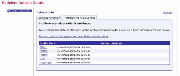
Since each profile field may appear on several pages (for example on the External Subscribe pages and on the Internal Edit Profile page), it would become burdensome to have to specify the display attributes for a given profile field on each page that this field appears on. To avoid this, it is possible to define defaults for the attributes of all profile fields of a dataset or list. The default attributes for a given profile field will be used whenever the profile field's placeholder appears on a page, unless that placeholder appearance defines its own attributes. In other words, if a profile field placeholder appears on the page without any attributes, then the default attributes will apply. If the placeholder on the page already contains individual attributes, then the default attributes are not used and the individual attributes apply (but only on this page).
To define the default attributes for a profile field, click the Profile-Placeholder Default Attributes link at the bottom of the Pages table (on the Membership Area Layout tab while customizing the subscriber pages of a dataset or list). The Profile-Placeholder Default Attributes information is displayed.
Figure 10 Defining the Attributes for a Profile Field
Click on the name of the field you want to customize. The Edit Default Attributes screen opens; specify the attributes in the same way as for specifying them in the placeholder, when including the placeholder in the customized HTML code.
Figure 11 The Edit Default Attributes Screen

For example, assume there is a profile field called "FNAME" and that it should display with an edit field of size "40". Either include the placeholder "{{maestro:profileFNAME size="40"}}" directly on the page, or include the placeholder without attributes ("{{maestro:profileFNAME}}") on the page and define the default attribute "size="40"" on the Edit Default Attributes screen.
Note: The default versions of all membership area pages (the versions that are used if no customized versions are provided) all use the profile field placeholders without any individual attributes; therefore, any pages that are displayed in their default state will also use the profile-placeholder default attributes you define.

